Thumbnail #1: This thumbnail is overall a pretty & Quaint design for a vegan restaurant, hence where the name "love leaf" comes from, however isn't very sophisticated or clever to use which often catches the intended audiences eyes. I wanted my logo to appeal to a sophisticated, higher-up end target audience, and this design targets a more girl-next-door and casual audience as it's a simple and aesthetically pleasing design with not many artistic techniques such as negative space, etc.
Thumbnail #3: The above logo design is clever, in my opinion. This design has the potential to be very SOPHISTICATED if the APPROPRIATE colour scheme is used, and another element is added to really juxtapose and highlight the pictorial symbol for the swan cafe typography, using an actual swan for the 's' letter. A stark black background against the logo could even potentially create negative space, and overall this design could be SUCCESSFUL in capturing the target audience's attention. Overall, the logo itself is not very aesthetically pleasing, but has the ultimate potential to be with the addition of another binding element to really EMPHASISE the purpose of the logo.
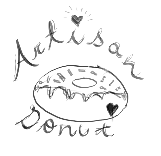
Thumbnail #5: tHIS IS A SWEET & SIMPLE LOGO TO INCORPORATE FOR A THAI RESTAURANT, AND AS SEEN BY THE BUSINESSES NAME, IS CALLED 'PHo''NOMENAL Pho, instead of the word 'PHENOMENAL', which can be considered to be clever. This design isn't very SOPHISTICATED but could have some potential to be if the APPROPRIATE colour scheme is used, and the heart in the middle of the bowl is removed to create some regality and mystery, and to juxtapose which creates contrast and sophistication. The design ITSELF uses fine calligraphy for typography which is quite fancy, and ACHIEVES formality, and is also an aesthetically pleasing design which creates some visual HIERARCHY.
Thumbnail #7: This particular logo design could have the potential to become a successful design but has many elements which might create too much 'noise' in the logo. This design depicts an oven mitt with the business name of the love place as the oven id the place where food with love is made, so I thought that was quite cozy and sweet, however not very sophisticated which was the target audience I was aiming for. This design is sweet and simplistic in nature but doesn't quite reach the intended purpose.
thumbnail #9: This is my favourite logo out of all the others as I think it is quite simplistic yet sweet & could have a lot of potential to become a sophisticated, successful logo. The business' name is love burger and so therefore, the logo depicts a burger with a bite taken out of it in the shape of a heart. I BELIEVE USING NEGATIVE SPACE, AND A PICTORIAL DESIGN WILL GREATLY INCREASE HOW SUCCESFUL THIS DESIGN WILL BE AS IT IS VERY EASILY IDENTIFIBLE AND CAN CATCH THE TARGET AUDIENCE'S EYE EASILY. love BURGER IS ALSO A SHORT AND SIMPLE NAME AND IN CALLIGRAPHY SO THAT IT IS MUCH MORE FANCY AND GIVES OFF A SOPHISTICATED VIBE.
Thumbnail #2: Overall, this logo design is much more sophisticated than the last as it features the pictorial element of a crown, which promotes the idea of regality, wealth, and sophistication. However, the pictorial design doesn't use a letter or negative space mark which may not be as attracting if it did, but I feel like it reaches the target audience intended, however could be more aesthetically pleasing and use less elements in certain places to ACHIEVE visual HIERARCHY which creates strong contrast, which also promotes sophistication and 'mystery.'
Thumbnail #4: This logo is one of the most sophisticated out of all the logo thumbnails in my opinion, due to the minimalistic approach taken whilst DESIGNING the logo. THIS LOGO DOESN'T FEATURE MANY COMPLICATED ELEMENTS AT ALL, WITH THE AUDIENCE'S EYE IMMEDIATELY ATTRACTED TO THE PICTORIAL DESIGN OF THE SWAN IN THE MIDDLE OF THE CANVAS, WHICH COULD BE EASILY IDENTIFIED BY ANYONE AND BECOME A TRADEMARK WHILST IDENTIFYING THIS LOGO. tHE ACCOMPANYING TEXT IS QUITE QUAINT AND SIMPLE, TO AGAIN JUST BRING ATTENTION TO THE MAIN SYMBOL OF THE LOGO, WHICH USES AN ANIMAL MARK. overall, this is an aesthetically pleasing design, is MINIMALISTIC & therefore very sophisticated, but could also be considered to be a bit boring and not very creative, therefore unoriginal.
Thumbnail #6: in my opinion, this logo is very messy. It doesn't make much sense for a restaurant logo, unless the RESTAURANT was space/galaxy/moon themed as it consists of the pictorial design of a girl standing on the moon holding a fork. It does hold some symbolism to it and could be clever but is not used APPROPRIATELY in the right context, therefore doesn't achieve the purpose of targeting a SOPHISTICATED audience. It's also too busy in my opinion, and creates a lot of 'noise', as there isn't one particular element that the audiences eye is drawn to at first glance. Therefore, i don't feel like this would be a SUCCESSFUL design to use for my logo.
Thumbnail #8: i FEEL LIKE THIS COULD BE A VERY SUCCESFUL LOGO IN MY OPINION. tHE ADDITION OF THE ELEMENT OF THE CROWN WITH THE UTENSILS ON IT SUGGESTS REGALITY AND AGAIN, WEALTH WHICH PROMOTES SOPHISTICATED AND TARGETS A PARTICULAR AUDIENCES. the use of the utensils IMMEDIATELY make the audience realise it's a restaurant and one of the best, as the UTENSILS are placed on a crown and not on a basic, simple chefs hat. If an APPROPRIATE colour scheme was applied such as regal purples and red, or even black and white, this could be a very SUCCESSFUL design .